
Most people picture the swoosh instantly. And that’s exactly why so many entrepreneurs (and even some big companies) still believe: “A great logo = a great brand.”
Spoiler: It doesn’t. A logo is not a brand. Confusing the two is one of the most expensive, most common, and most avoidable mistakes in business.
Let’s break it down clearly, with real-world examples, so you never fall into the trap again and so you can start building something that actually lasts.
What a Logo Actually Is (And What It Isn’t)
A logo is a visual mark. That’s literally it.
It’s the symbol, wordmark, icon, or combination designed to identify a company at a glance.
Classic examples:
- Apple’s bitten apple
- McDonald’s golden arches
- FedEx’s hidden arrow (between the E and x)
- Nike’s swoosh
These are fantastic logos. They’re simple, memorable, scalable, versatile, instantly recognizable.
But they are not the brand. The logo is the face. It’s a tool for quick recognition — nothing more, nothing less.
You could put the world’s most beautiful logo on a terrible product with awful service and guess what happens? No one cares about the logo. They remember the bad experience.
Here’s Nike’s iconic swoosh – simple genius:
Nike Bought ‘Swoosh’ Logo for $35 – Business Insider
What a Brand Really Is (The Full Picture)
A brand is the gut feeling people get when they interact with your business in any way.
It lives entirely in perception. It’s built from:
- Your core values & mission
- The quality & consistency of your product or service
- The tone of voice you use in every message
- How you treat customers (and employees)
- Your visual world (yes, including the logo — but also colors, typography, photography style, packaging, store design, website feel…)
- The stories you tell (and the stories customers tell about you)
- The emotional connection people feel
That’s why two companies can have similar-looking logos but wildly different brands. One feels trustworthy, premium, exciting. The other feels cheap, inconsistent, forgettable.
A logo is the business card. A brand is the reputation, the personality, the relationship.
Key Differences Between Brand and Logo: Side-by-Side
To make it crystal clear, here’s a quick comparison:
- Scope: Logo is narrow (visual ID only). Brand is broad (everything from ads to customer chats).
- Purpose: Logo identifies. Brand builds loyalty and emotion.
- Lifespan: Logos can be refreshed (think Pepsi’s evolutions). Brands endure if values stay true.
- Creation: Logo takes weeks (design process). Brand takes years (consistent actions).
- Impact: A bad logo hurts first impressions. A bad brand loses customers for life.
Real talk: A killer logo on a shady company? It’s lipstick on a pig. But a solid brand with a simple logo? It shines.
Real-World Examples: Brand vs Logo in Action
Let’s look at icons to see the difference play out.
Nike — The Swoosh vs “Just Do It”
The swoosh is brilliant: simple, dynamic, perfect. But Nike’s brand is empowerment, athletic excellence, pushing limits, innovation. The logo alone wouldn’t mean much without the legendary ads, athlete endorsements, product quality, and consistent message that make you feel unstoppable.
Apple — The Bitten Apple vs Innovation Brand
The logo is minimalist perfection. But Apple’s brand is sleek design, user-friendly tech, “think different” ethos. Without the ecosystem (iPhones, Macs, customer service), the logo would be just fruit.
Apple’s iconic bitten apple logo:
The reason the Apple logo has a bite taken out of it
Coca-Cola — Script Logo vs Happiness Brand
The cursive logo is timeless. But the brand? Joy, togetherness, holidays. It’s why you reach for Coke over generic cola the feeling, not the font.
Coca-Cola’s classic script logo:
The Coca-Cola Logo: The Story Behind One of the Most Iconic …
And a failure: Gap’s 2010 logo redesign. They ditched the classic for a bland new one – backlash was so fierce, they reverted in a week. The logo flopped because it didn’t align with Gap’s affordable, casual brand vibe. Cost: PR nightmare and lost trust.
Gap’s old vs new logo disaster:
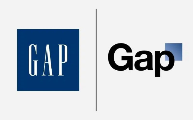
10 Design Fails to Learn From | DesignRush
Why Confusing Brand and Logo Hurts (And How to Fix It)
Mixing them up leads to disasters: Spending big on a logo redesign while ignoring bad reviews or inconsistent messaging. Result? Wasted money and confused customers. Stats show 60% of consumers avoid brands with unappealing logos even if reviews are good—but a bad brand overall? They flee faster.
The fix? Start with brand strategy: Define your why, who, and how. Then design the logo to match. Brands built this way (like Patagonia’s eco-mission) create loyal fans who evangelize for you.
In a crowded market, a strong brand turns one-time buyers into lifelong advocates.
Final Thoughts: Build the Brand, Let the Logo Shine
Next time someone says “I need a new brand” but means logo, smile and share this. A logo is the tip of the iceberg; the brand is the massive force beneath.
